Apr 21, 2025
UX in Operating Systems
Questioning if more customization could improve usability in modern operating systems.
Blog
Big Tech
Blog
Just marketing?
When personalization misses the mark
When Google introduced Material You in 2021—the successor to Material Design 2—they made a bold promise: to build software around the user. Even today, the Material You (Material Design 3) website highlights this ambition with the statement:
Users customize their desktops in the physical and digital worlds with images that are personal and provide comfort and joy. We built upon this insight to generate unique Material palettes for everyone, derived from a personal signal—wallpaper—that can be applied to their entire experience.
Just above that quote sits a looping gif full of soft, rounded shapes, vibrant colors, and squiggly lines—emphasizing playfulness and personality.
As a UX designer, statements like these always catch my attention. And as a long-time Android fan, I was especially intrigued—and honestly, a little baffled—by this shift in 2021. The story Google told and the product they delivered didn’t quite align for me. I’ve always viewed my phone as a tool—something that should feel clean, minimal, and efficient. I applaud the effort to give users more control and personal expression, but it left me wondering: if the goal was to create something I would want, how did we end up with a system so focused on being playful and expressive?
They are both doing this
Recently, I came across a post on LinkedIn. Now, normally I’d scroll right past the typical UX think-pieces from LinkedIn influencers—but this one struck a chord.
It was about the two different user experiences within iOS when receiving a phone call. When your phone is unlocked, you get two clear buttons: Accept and Decline—a straightforward tap interface. But when the phone is locked, you get a single slider to answer the call, with no visible decline option (though you can still decline using the power button).
The author of the post explained:
When your phone is locked, you swipe to answer.
This prevents accidental touches when your phone is in your pocket or bag. Sliding is a deliberate action.
When your phone is unlocked, you tap to answer.
Tapping is easier and quicker when you're already interacting with the screen - efficiency matters here.
This subtle shift in interaction is Apple quietly thinking ahead :
Understanding user context
Prioritizing convenience
Preventing unintended actions
This small but thoughtful difference highlights how good UI/UX anticipates context and adapts to prevent friction or frustration.
Now, here’s the thing: while this UX detail is clever in isolation, it can also be confusing. The experience of answering a call changes based on whether your phone is locked or unlocked—swipe in one case, tap in the other. That kind of inconsistency can trip people up.It breaks the muscle memory users build over time. One moment you're tapping a clear “Accept” button, the next you're swiping with no visible way to decline. Even if the reasoning behind it is sound, the result is an interaction that feels inconsistent—especially for something as basic and frequent as answering a phone call. Something I personally dislike very much.
Consistency in interaction patterns builds confidence. When the same action behaves differently depending on subtle conditions, it risks creating friction. And for something as simple as answering a call, that extra moment of hesitation can feel surprisingly jarring.

Solution
Customization in operating systems is the next UX frontier
So what do you do then, Nick, I hear you say?
Well, the foundation of our operating systems needs to shift—fundamentally. Instead of building rigid flows that users have to adapt to, these everyday devices should prioritize flexibility. They need to support real customization. If I want a default call screen layout that fits my preferences, let me set that up. Not everyone will want to tweak their UI—but that’s no reason to deny the option entirely.
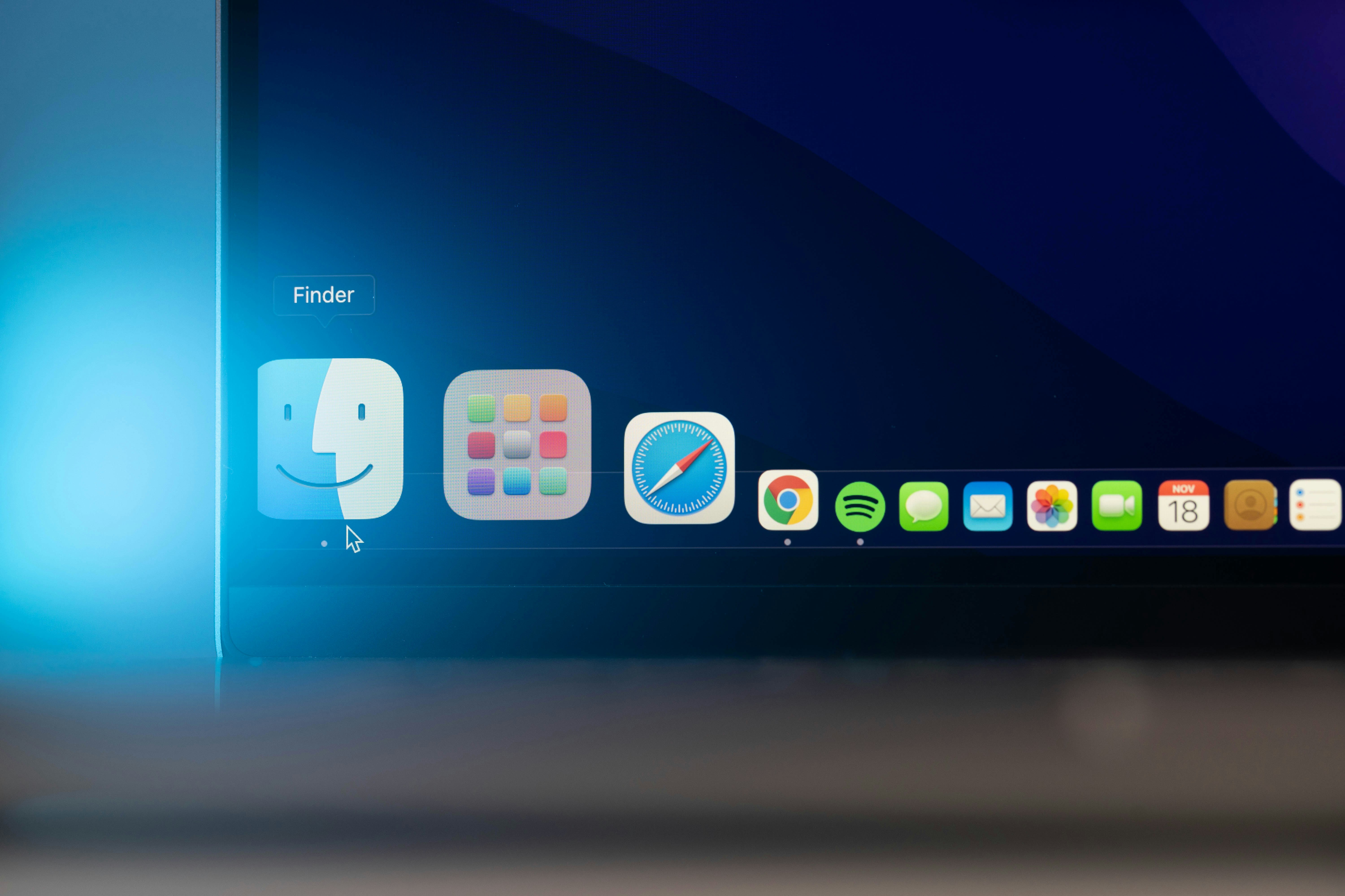
Some operating systems, like Windows and Android, are ahead here. Android, for instance, lets you change the home screen grid layout—five icons wide instead of four. It’s a small detail, but it reflects a broader philosophy: give users choice. Apple has started catching up too. Only recently have they allowed more freedom in arranging home and lock screens. They even introduced the new Action Button, which lets users assign a custom function to a physical control.
But here’s the thing: they’re still playing it safe.The real question these companies should ask is: “Can we do more?”
Why stop at one custom action? Why not let users assign different behaviors for single taps, double taps, long presses? Why stop at colors and fonts—why not let people choose the style of their interface? Rounded icons or sharp ones? Professional or playful? And why not allow the system to shift styles based on context (which the users provides)?
The company that figures this out—truly figures it out—and delivers deep customization without throwing users into a terminal window... That’s the one that will define the next era of user experience.
Apr 21, 2025
UX in Operating Systems
Questioning if more customization could improve usability in modern operating systems.
Blog
Big Tech
Blog
Just marketing?
When personalization misses the mark
When Google introduced Material You in 2021—the successor to Material Design 2—they made a bold promise: to build software around the user. Even today, the Material You (Material Design 3) website highlights this ambition with the statement:
Users customize their desktops in the physical and digital worlds with images that are personal and provide comfort and joy. We built upon this insight to generate unique Material palettes for everyone, derived from a personal signal—wallpaper—that can be applied to their entire experience.
Just above that quote sits a looping gif full of soft, rounded shapes, vibrant colors, and squiggly lines—emphasizing playfulness and personality.
As a UX designer, statements like these always catch my attention. And as a long-time Android fan, I was especially intrigued—and honestly, a little baffled—by this shift in 2021. The story Google told and the product they delivered didn’t quite align for me. I’ve always viewed my phone as a tool—something that should feel clean, minimal, and efficient. I applaud the effort to give users more control and personal expression, but it left me wondering: if the goal was to create something I would want, how did we end up with a system so focused on being playful and expressive?
They are both doing this
Recently, I came across a post on LinkedIn. Now, normally I’d scroll right past the typical UX think-pieces from LinkedIn influencers—but this one struck a chord.
It was about the two different user experiences within iOS when receiving a phone call. When your phone is unlocked, you get two clear buttons: Accept and Decline—a straightforward tap interface. But when the phone is locked, you get a single slider to answer the call, with no visible decline option (though you can still decline using the power button).
The author of the post explained:
When your phone is locked, you swipe to answer.
This prevents accidental touches when your phone is in your pocket or bag. Sliding is a deliberate action.
When your phone is unlocked, you tap to answer.
Tapping is easier and quicker when you're already interacting with the screen - efficiency matters here.
This subtle shift in interaction is Apple quietly thinking ahead :
Understanding user context
Prioritizing convenience
Preventing unintended actions
This small but thoughtful difference highlights how good UI/UX anticipates context and adapts to prevent friction or frustration.
Now, here’s the thing: while this UX detail is clever in isolation, it can also be confusing. The experience of answering a call changes based on whether your phone is locked or unlocked—swipe in one case, tap in the other. That kind of inconsistency can trip people up.It breaks the muscle memory users build over time. One moment you're tapping a clear “Accept” button, the next you're swiping with no visible way to decline. Even if the reasoning behind it is sound, the result is an interaction that feels inconsistent—especially for something as basic and frequent as answering a phone call. Something I personally dislike very much.
Consistency in interaction patterns builds confidence. When the same action behaves differently depending on subtle conditions, it risks creating friction. And for something as simple as answering a call, that extra moment of hesitation can feel surprisingly jarring.
Solution
Customization in operating systems is the next UX frontier
So what do you do then, Nick, I hear you say?
Well, the foundation of our operating systems needs to shift—fundamentally. Instead of building rigid flows that users have to adapt to, these everyday devices should prioritize flexibility. They need to support real customization. If I want a default call screen layout that fits my preferences, let me set that up. Not everyone will want to tweak their UI—but that’s no reason to deny the option entirely.
Some operating systems, like Windows and Android, are ahead here. Android, for instance, lets you change the home screen grid layout—five icons wide instead of four. It’s a small detail, but it reflects a broader philosophy: give users choice. Apple has started catching up too. Only recently have they allowed more freedom in arranging home and lock screens. They even introduced the new Action Button, which lets users assign a custom function to a physical control.
But here’s the thing: they’re still playing it safe.The real question these companies should ask is: “Can we do more?”
Why stop at one custom action? Why not let users assign different behaviors for single taps, double taps, long presses? Why stop at colors and fonts—why not let people choose the style of their interface? Rounded icons or sharp ones? Professional or playful? And why not allow the system to shift styles based on context (which the users provides)?
The company that figures this out—truly figures it out—and delivers deep customization without throwing users into a terminal window... That’s the one that will define the next era of user experience.