2021
Accessify logo redesign
This case study outlines the development of the Accessify logo. The logo combines modern design principles with a focus on clarity and inclusivity, reinforcing the brand’s mission.
Branding
Logo Design
Intro
Bringing futuristic design and clarity to Accessify's visual identity.
Redesigning Accessify’s Logo: A Creative Side Project with Big Impact
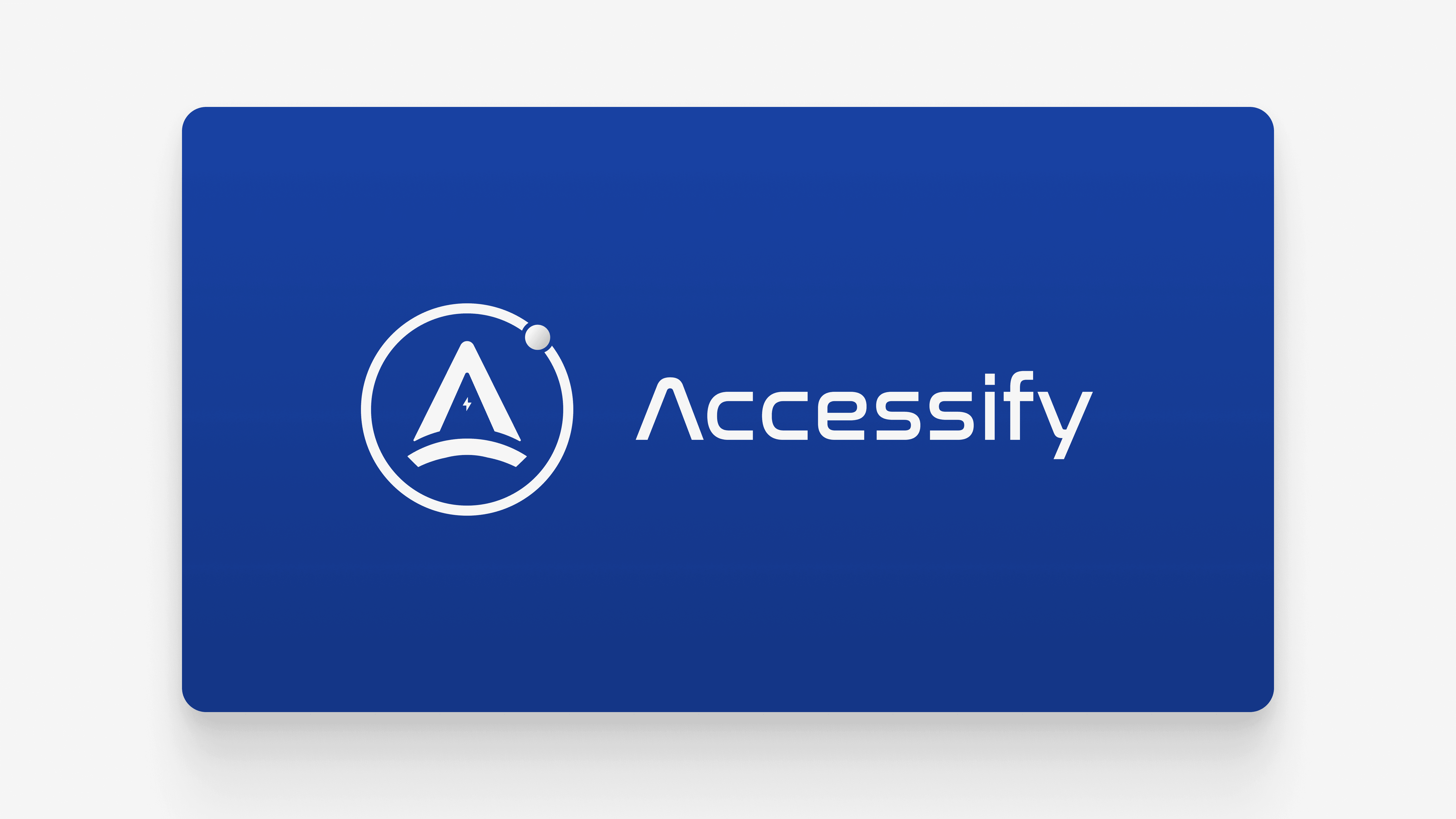
This case study highlights the redesign of the Accessify logo, a CMS developed by Sigma Solutions. While the primary focus during my time at Sigma was front-end development, this side project allowed me to tap into my creative skills. Drawing inspiration from the NASA logo and elements of futuristic design, I crafted a logo that embodies empowerment and innovation. Through multiple iterations, I refined the logo to ensure it was clear at all sizes, even down to 24px, making it both impactful and versatile for the brand’s marketing materials and CMS interface.

The setup
Creating identity: Designing Accessify’s logo to reflect innovation and empowerment.
At the time, Accessify lacked a distinct visual identity, which created a gap in its branding and recognition. As a CMS product developed by Sigma Solutions, it was essential for Accessify to have a strong, recognizable logo that could set it apart and communicate its purpose and values effectively. Without a logo, the product lacked a cohesive visual presence, making it harder to build brand recognition and trust among users.
For the redesign, I found inspiration in the iconic NASA logo, specifically the design elements that exude a sense of innovation and exploration. The blue color and sleek, bold font of the NASA logo stood out to me, evoking a futuristic and empowering feel—traits I wanted to reflect in the Accessify brand. This sense of boundless potential was key in crafting a logo that could resonate with the product’s goal of enabling users to achieve new heights through technology.
By drawing from this inspiration, I aimed to create a logo that not only felt modern and powerful but also aligned with the product’s mission and vision.
Solution
A logo that speaks to innovation: Accessify’s new visual identity makes a lasting impact.
The redesigned Accessify logo successfully encapsulated the product’s core values of innovation, empowerment, and forward-thinking technology. The sleek, modern design created a strong visual identity that resonated with both the team and users. Its clarity at various sizes—down to as small as 24px—ensured that the logo maintained its impact across all digital platforms, from the CMS interface to marketing materials.
The final logo received unanimous approval from the CEO and the team, who appreciated how it not only conveyed a sense of professionalism but also gave the brand a distinct presence in the market. The logo’s ability to scale across different mediums and maintain its clarity ensured that Accessify could confidently represent itself in both the digital space and its broader marketing efforts. The feedback from both internal stakeholders and users was overwhelmingly positive, proving that the logo design effectively aligned with the brand’s goals and vision for growth.

More Works
(GQ® — 02)
©2025

2021
Accessify logo redesign
This case study outlines the development of the Accessify logo. The logo combines modern design principles with a focus on clarity and inclusivity, reinforcing the brand’s mission.
Branding
Logo Design
Intro
Bringing futuristic design and clarity to Accessify's visual identity.
Redesigning Accessify’s Logo: A Creative Side Project with Big Impact
This case study highlights the redesign of the Accessify logo, a CMS developed by Sigma Solutions. While the primary focus during my time at Sigma was front-end development, this side project allowed me to tap into my creative skills. Drawing inspiration from the NASA logo and elements of futuristic design, I crafted a logo that embodies empowerment and innovation. Through multiple iterations, I refined the logo to ensure it was clear at all sizes, even down to 24px, making it both impactful and versatile for the brand’s marketing materials and CMS interface.
The setup
Creating identity: Designing Accessify’s logo to reflect innovation and empowerment.
At the time, Accessify lacked a distinct visual identity, which created a gap in its branding and recognition. As a CMS product developed by Sigma Solutions, it was essential for Accessify to have a strong, recognizable logo that could set it apart and communicate its purpose and values effectively. Without a logo, the product lacked a cohesive visual presence, making it harder to build brand recognition and trust among users.
For the redesign, I found inspiration in the iconic NASA logo, specifically the design elements that exude a sense of innovation and exploration. The blue color and sleek, bold font of the NASA logo stood out to me, evoking a futuristic and empowering feel—traits I wanted to reflect in the Accessify brand. This sense of boundless potential was key in crafting a logo that could resonate with the product’s goal of enabling users to achieve new heights through technology.
By drawing from this inspiration, I aimed to create a logo that not only felt modern and powerful but also aligned with the product’s mission and vision.
Solution
A logo that speaks to innovation: Accessify’s new visual identity makes a lasting impact.
The redesigned Accessify logo successfully encapsulated the product’s core values of innovation, empowerment, and forward-thinking technology. The sleek, modern design created a strong visual identity that resonated with both the team and users. Its clarity at various sizes—down to as small as 24px—ensured that the logo maintained its impact across all digital platforms, from the CMS interface to marketing materials.
The final logo received unanimous approval from the CEO and the team, who appreciated how it not only conveyed a sense of professionalism but also gave the brand a distinct presence in the market. The logo’s ability to scale across different mediums and maintain its clarity ensured that Accessify could confidently represent itself in both the digital space and its broader marketing efforts. The feedback from both internal stakeholders and users was overwhelmingly positive, proving that the logo design effectively aligned with the brand’s goals and vision for growth.
More Works
(GQ® — 02)
©2025
2021
Accessify logo redesign
This case study outlines the development of the Accessify logo. The logo combines modern design principles with a focus on clarity and inclusivity, reinforcing the brand’s mission.
Branding
Logo Design
Intro
Bringing futuristic design and clarity to Accessify's visual identity.
Redesigning Accessify’s Logo: A Creative Side Project with Big Impact
This case study highlights the redesign of the Accessify logo, a CMS developed by Sigma Solutions. While the primary focus during my time at Sigma was front-end development, this side project allowed me to tap into my creative skills. Drawing inspiration from the NASA logo and elements of futuristic design, I crafted a logo that embodies empowerment and innovation. Through multiple iterations, I refined the logo to ensure it was clear at all sizes, even down to 24px, making it both impactful and versatile for the brand’s marketing materials and CMS interface.
The setup
Creating identity: Designing Accessify’s logo to reflect innovation and empowerment.
At the time, Accessify lacked a distinct visual identity, which created a gap in its branding and recognition. As a CMS product developed by Sigma Solutions, it was essential for Accessify to have a strong, recognizable logo that could set it apart and communicate its purpose and values effectively. Without a logo, the product lacked a cohesive visual presence, making it harder to build brand recognition and trust among users.
For the redesign, I found inspiration in the iconic NASA logo, specifically the design elements that exude a sense of innovation and exploration. The blue color and sleek, bold font of the NASA logo stood out to me, evoking a futuristic and empowering feel—traits I wanted to reflect in the Accessify brand. This sense of boundless potential was key in crafting a logo that could resonate with the product’s goal of enabling users to achieve new heights through technology.
By drawing from this inspiration, I aimed to create a logo that not only felt modern and powerful but also aligned with the product’s mission and vision.
Solution
A logo that speaks to innovation: Accessify’s new visual identity makes a lasting impact.
The redesigned Accessify logo successfully encapsulated the product’s core values of innovation, empowerment, and forward-thinking technology. The sleek, modern design created a strong visual identity that resonated with both the team and users. Its clarity at various sizes—down to as small as 24px—ensured that the logo maintained its impact across all digital platforms, from the CMS interface to marketing materials.
The final logo received unanimous approval from the CEO and the team, who appreciated how it not only conveyed a sense of professionalism but also gave the brand a distinct presence in the market. The logo’s ability to scale across different mediums and maintain its clarity ensured that Accessify could confidently represent itself in both the digital space and its broader marketing efforts. The feedback from both internal stakeholders and users was overwhelmingly positive, proving that the logo design effectively aligned with the brand’s goals and vision for growth.
More Works
©2025