2023
Story Designer
This case study covers the redesign of the Story Designer interface, focused on enhancing scalability and user experience. The changes aimed to address key pain points while laying the groundwork for long-term improvements.
Product Design
SaaS
Start
When the system broke under pressure, we didn’t patch it—we redesigned it for what's next.
Enhancing a Presentation Platform for Enterprise Growth
This project was completed during my time at Purple Digital, where I worked on their core SaaS product called "Hyro"—an enterprise-level presentation platform designed for use in immersive experience rooms and customer experience centers. The tool enables large corporations to deliver engaging, interactive presentations. As the client base and user demand grew, it became clear that the existing implementation lacked scalability. I was tasked with identifying and designing a scalable solution to support the platform’s growth and performance needs.
Problem
As usage of the platform scaled, the limitations of its designer interface began to surface. What once worked for smaller teams no longer met the demands of enterprise users. This case study highlights the core UX issues that emerged—and how they signaled the need for a smarter, more scalable design solution.
As the product matured and its user base grew, the limitations of the original designer interface became increasingly clear. Initially designed for smaller-scale use, the interface struggled to keep up with the evolving demands of enterprise users. One of the most pressing issues was the inefficient use of screen space. The UI relied heavily on fixed sections and excessive padding, causing small interface elements to occupy large portions of the screen. This design choice significantly reduced the available canvas space—nearly 50% of the horizontal area was taken up by the UI, which is a major drawback for a tool intended to enable visual storytelling.
Beyond spatial inefficiency, the interface suffered from poor structural logic. Core product components were not presented in an intuitive hierarchy, making it difficult for users to understand and manipulate complex presentations. Important tools were buried behind dropdown menus, and the number of clicks required to complete even simple actions led to frustration. The interface lacked cohesion and flow, often breaking the user's focus and slowing down their workflow.
These issues weren't just cosmetic—they directly impacted productivity and user satisfaction. Feedback from clients consistently pointed to the UI as a major pain point. The design felt restrictive, overwhelming, and inefficient for users trying to create immersive, high-impact presentations. It became clear that a complete rethinking of the designer experience was needed—not just to fix what was broken, but to create a scalable foundation for future growth.
Solution
Structure isn’t just visual—it’s the backbone of a scalable user experience.
I worked iteratively over several weeks to redesign the Story Designer interface, with a focus on scalability, logic, and feasibility for long-term development. The objective was to create a structure that would not only solve current usability challenges but also support future expansion and ease of maintenance for the product team.
The process began with a collaborative effort alongside the other designer to build a logic map, outlining all existing UI elements and their functionalities. This map served as a foundation to reorganize the interface in a more structured, intuitive way—prioritizing clarity, accessibility, and scalability.
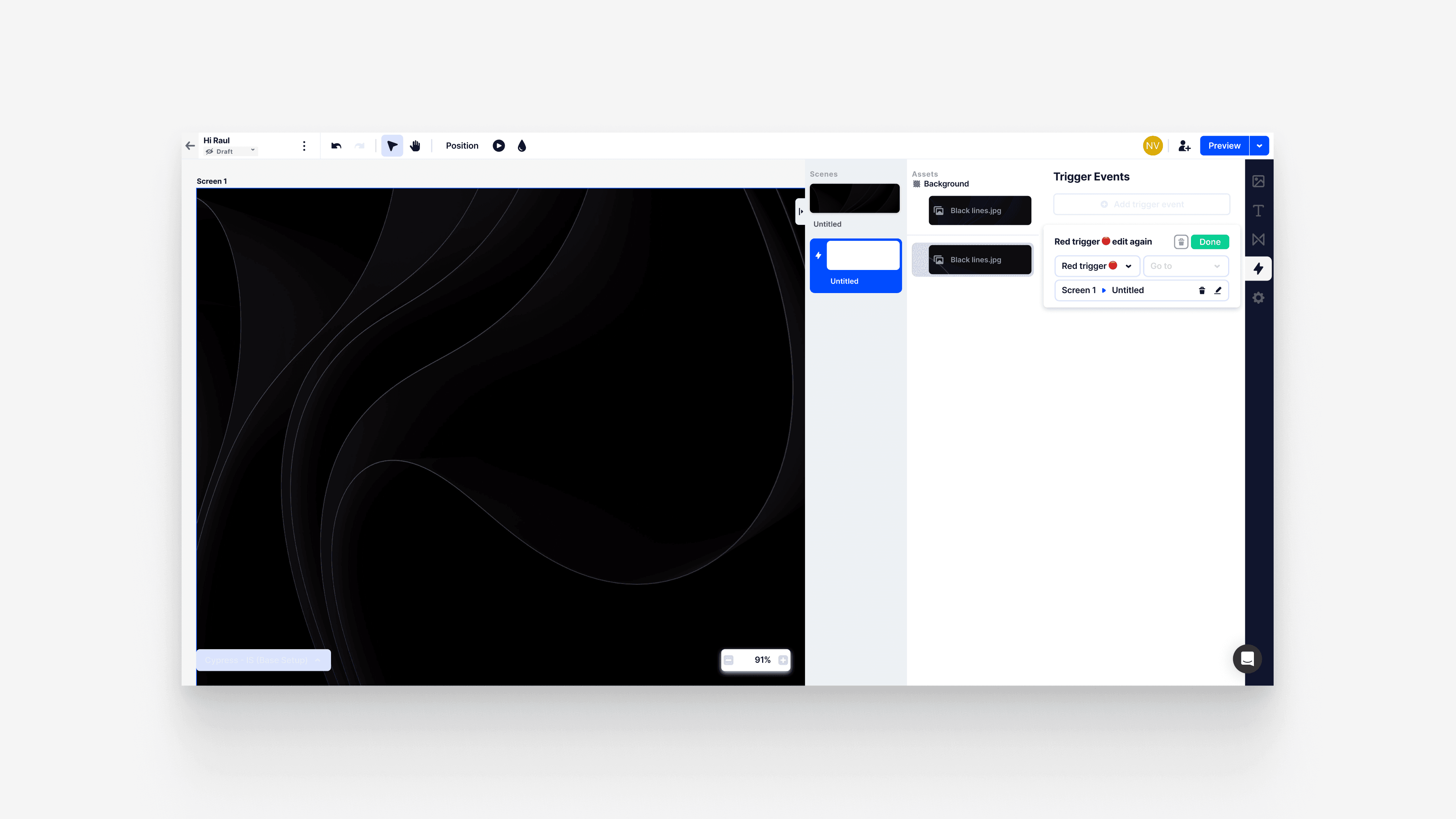
Once the new structure was defined, I moved into visualizing it on-screen. The redesigned layout followed a clear, modular structure:
Top Bar – Houses essential presentation settings such as the story title, publication status, and sharing permissions. Positioned for quick access to high-level controls.
Navigation Bar – Displays the main structure and hierarchy of the presentation. Users can easily view all items on each screen, inspect their attributes, and manage their placement using drag-and-drop or visibility toggles revealed on hover.
Detail Menu – A context-sensitive panel that adapts based on the selected item. For instance, selecting text would surface options to change font, size, or behavior during presentation mode (e.g., on-click animations). This menu also grants access to other tools, such as the asset library and prototyping mode for directing presentation flow.
This new structure aimed to streamline user workflows, reduce friction, and establish a foundation that could scale with the product’s growing complexity.


Effect
Progress, not perfection—early wins set the stage for lasting impact.
The redesigned Story Designer interface delivered substantial benefits for both users and the business. By addressing key usability challenges and introducing a more structured, scalable framework, the project laid the groundwork for long-term improvements. Although the full scope of the redesign is still in progress, the initial changes had an immediate positive impact on the user experience. Users found the new layout more intuitive, with easier navigation and less friction in managing complex presentations. The streamlined interface made it simpler for users to access important tools, reduce unnecessary steps, and focus on creating content without feeling overwhelmed by the design.
For the business, the partial implementation of the redesign proved valuable in several key areas. It demonstrated the potential for scaling the platform and adapting it to evolving user needs without requiring major overhauls. The flexibility of the new structure allowed the product team to continue iterating on features without disrupting the core user experience, which was crucial as the platform grew. While the redesign isn’t yet fully realized, it has already improved user engagement, reduced support requests, and fostered a stronger connection with clients who recognize the platform’s increasing ease of use and reliability.
This iterative process also helped to future-proof the product by creating a more adaptable framework for future updates. Even though the full vision of the redesigned Story Designer hasn’t been fully implemented, the benefits are already evident, setting the stage for ongoing enhancements and continued growth. Ultimately, the project showcased how thoughtful design improvements—no matter the stage of implementation—can deliver measurable results and lay the foundation for continued success.
More Works
(GQ® — 02)
©2025

2023
Story Designer
This case study covers the redesign of the Story Designer interface, focused on enhancing scalability and user experience. The changes aimed to address key pain points while laying the groundwork for long-term improvements.
Product Design
SaaS
Start
When the system broke under pressure, we didn’t patch it—we redesigned it for what's next.
Enhancing a Presentation Platform for Enterprise Growth
This project was completed during my time at Purple Digital, where I worked on their core SaaS product called "Hyro"—an enterprise-level presentation platform designed for use in immersive experience rooms and customer experience centers. The tool enables large corporations to deliver engaging, interactive presentations. As the client base and user demand grew, it became clear that the existing implementation lacked scalability. I was tasked with identifying and designing a scalable solution to support the platform’s growth and performance needs.
Problem
As usage of the platform scaled, the limitations of its designer interface began to surface. What once worked for smaller teams no longer met the demands of enterprise users. This case study highlights the core UX issues that emerged—and how they signaled the need for a smarter, more scalable design solution.
As the product matured and its user base grew, the limitations of the original designer interface became increasingly clear. Initially designed for smaller-scale use, the interface struggled to keep up with the evolving demands of enterprise users. One of the most pressing issues was the inefficient use of screen space. The UI relied heavily on fixed sections and excessive padding, causing small interface elements to occupy large portions of the screen. This design choice significantly reduced the available canvas space—nearly 50% of the horizontal area was taken up by the UI, which is a major drawback for a tool intended to enable visual storytelling.
Beyond spatial inefficiency, the interface suffered from poor structural logic. Core product components were not presented in an intuitive hierarchy, making it difficult for users to understand and manipulate complex presentations. Important tools were buried behind dropdown menus, and the number of clicks required to complete even simple actions led to frustration. The interface lacked cohesion and flow, often breaking the user's focus and slowing down their workflow.
These issues weren't just cosmetic—they directly impacted productivity and user satisfaction. Feedback from clients consistently pointed to the UI as a major pain point. The design felt restrictive, overwhelming, and inefficient for users trying to create immersive, high-impact presentations. It became clear that a complete rethinking of the designer experience was needed—not just to fix what was broken, but to create a scalable foundation for future growth.
Solution
Structure isn’t just visual—it’s the backbone of a scalable user experience.
I worked iteratively over several weeks to redesign the Story Designer interface, with a focus on scalability, logic, and feasibility for long-term development. The objective was to create a structure that would not only solve current usability challenges but also support future expansion and ease of maintenance for the product team.
The process began with a collaborative effort alongside the other designer to build a logic map, outlining all existing UI elements and their functionalities. This map served as a foundation to reorganize the interface in a more structured, intuitive way—prioritizing clarity, accessibility, and scalability.
Once the new structure was defined, I moved into visualizing it on-screen. The redesigned layout followed a clear, modular structure:
Top Bar – Houses essential presentation settings such as the story title, publication status, and sharing permissions. Positioned for quick access to high-level controls.
Navigation Bar – Displays the main structure and hierarchy of the presentation. Users can easily view all items on each screen, inspect their attributes, and manage their placement using drag-and-drop or visibility toggles revealed on hover.
Detail Menu – A context-sensitive panel that adapts based on the selected item. For instance, selecting text would surface options to change font, size, or behavior during presentation mode (e.g., on-click animations). This menu also grants access to other tools, such as the asset library and prototyping mode for directing presentation flow.
This new structure aimed to streamline user workflows, reduce friction, and establish a foundation that could scale with the product’s growing complexity.
Effect
Progress, not perfection—early wins set the stage for lasting impact.
The redesigned Story Designer interface delivered substantial benefits for both users and the business. By addressing key usability challenges and introducing a more structured, scalable framework, the project laid the groundwork for long-term improvements. Although the full scope of the redesign is still in progress, the initial changes had an immediate positive impact on the user experience. Users found the new layout more intuitive, with easier navigation and less friction in managing complex presentations. The streamlined interface made it simpler for users to access important tools, reduce unnecessary steps, and focus on creating content without feeling overwhelmed by the design.
For the business, the partial implementation of the redesign proved valuable in several key areas. It demonstrated the potential for scaling the platform and adapting it to evolving user needs without requiring major overhauls. The flexibility of the new structure allowed the product team to continue iterating on features without disrupting the core user experience, which was crucial as the platform grew. While the redesign isn’t yet fully realized, it has already improved user engagement, reduced support requests, and fostered a stronger connection with clients who recognize the platform’s increasing ease of use and reliability.
This iterative process also helped to future-proof the product by creating a more adaptable framework for future updates. Even though the full vision of the redesigned Story Designer hasn’t been fully implemented, the benefits are already evident, setting the stage for ongoing enhancements and continued growth. Ultimately, the project showcased how thoughtful design improvements—no matter the stage of implementation—can deliver measurable results and lay the foundation for continued success.
More Works
(GQ® — 02)
©2025
2023
Story Designer
This case study covers the redesign of the Story Designer interface, focused on enhancing scalability and user experience. The changes aimed to address key pain points while laying the groundwork for long-term improvements.
Product Design
SaaS
Start
When the system broke under pressure, we didn’t patch it—we redesigned it for what's next.
Enhancing a Presentation Platform for Enterprise Growth
This project was completed during my time at Purple Digital, where I worked on their core SaaS product called "Hyro"—an enterprise-level presentation platform designed for use in immersive experience rooms and customer experience centers. The tool enables large corporations to deliver engaging, interactive presentations. As the client base and user demand grew, it became clear that the existing implementation lacked scalability. I was tasked with identifying and designing a scalable solution to support the platform’s growth and performance needs.
Problem
As usage of the platform scaled, the limitations of its designer interface began to surface. What once worked for smaller teams no longer met the demands of enterprise users. This case study highlights the core UX issues that emerged—and how they signaled the need for a smarter, more scalable design solution.
As the product matured and its user base grew, the limitations of the original designer interface became increasingly clear. Initially designed for smaller-scale use, the interface struggled to keep up with the evolving demands of enterprise users. One of the most pressing issues was the inefficient use of screen space. The UI relied heavily on fixed sections and excessive padding, causing small interface elements to occupy large portions of the screen. This design choice significantly reduced the available canvas space—nearly 50% of the horizontal area was taken up by the UI, which is a major drawback for a tool intended to enable visual storytelling.
Beyond spatial inefficiency, the interface suffered from poor structural logic. Core product components were not presented in an intuitive hierarchy, making it difficult for users to understand and manipulate complex presentations. Important tools were buried behind dropdown menus, and the number of clicks required to complete even simple actions led to frustration. The interface lacked cohesion and flow, often breaking the user's focus and slowing down their workflow.
These issues weren't just cosmetic—they directly impacted productivity and user satisfaction. Feedback from clients consistently pointed to the UI as a major pain point. The design felt restrictive, overwhelming, and inefficient for users trying to create immersive, high-impact presentations. It became clear that a complete rethinking of the designer experience was needed—not just to fix what was broken, but to create a scalable foundation for future growth.
Solution
Structure isn’t just visual—it’s the backbone of a scalable user experience.
I worked iteratively over several weeks to redesign the Story Designer interface, with a focus on scalability, logic, and feasibility for long-term development. The objective was to create a structure that would not only solve current usability challenges but also support future expansion and ease of maintenance for the product team.
The process began with a collaborative effort alongside the other designer to build a logic map, outlining all existing UI elements and their functionalities. This map served as a foundation to reorganize the interface in a more structured, intuitive way—prioritizing clarity, accessibility, and scalability.
Once the new structure was defined, I moved into visualizing it on-screen. The redesigned layout followed a clear, modular structure:
Top Bar – Houses essential presentation settings such as the story title, publication status, and sharing permissions. Positioned for quick access to high-level controls.
Navigation Bar – Displays the main structure and hierarchy of the presentation. Users can easily view all items on each screen, inspect their attributes, and manage their placement using drag-and-drop or visibility toggles revealed on hover.
Detail Menu – A context-sensitive panel that adapts based on the selected item. For instance, selecting text would surface options to change font, size, or behavior during presentation mode (e.g., on-click animations). This menu also grants access to other tools, such as the asset library and prototyping mode for directing presentation flow.
This new structure aimed to streamline user workflows, reduce friction, and establish a foundation that could scale with the product’s growing complexity.
Effect
Progress, not perfection—early wins set the stage for lasting impact.
The redesigned Story Designer interface delivered substantial benefits for both users and the business. By addressing key usability challenges and introducing a more structured, scalable framework, the project laid the groundwork for long-term improvements. Although the full scope of the redesign is still in progress, the initial changes had an immediate positive impact on the user experience. Users found the new layout more intuitive, with easier navigation and less friction in managing complex presentations. The streamlined interface made it simpler for users to access important tools, reduce unnecessary steps, and focus on creating content without feeling overwhelmed by the design.
For the business, the partial implementation of the redesign proved valuable in several key areas. It demonstrated the potential for scaling the platform and adapting it to evolving user needs without requiring major overhauls. The flexibility of the new structure allowed the product team to continue iterating on features without disrupting the core user experience, which was crucial as the platform grew. While the redesign isn’t yet fully realized, it has already improved user engagement, reduced support requests, and fostered a stronger connection with clients who recognize the platform’s increasing ease of use and reliability.
This iterative process also helped to future-proof the product by creating a more adaptable framework for future updates. Even though the full vision of the redesigned Story Designer hasn’t been fully implemented, the benefits are already evident, setting the stage for ongoing enhancements and continued growth. Ultimately, the project showcased how thoughtful design improvements—no matter the stage of implementation—can deliver measurable results and lay the foundation for continued success.
More Works
©2025