2023
The design system for a new designer
This case study focuses on the redesign of Hyro’s design system to address scalability and usability issues. A new, modular system was developed in Figma to improve consistency and speed up design workflows.
Photography
Studio
Know More
Building a scalable future: Designing a flexible system for growth and consistency.
Redesigning for Scale: Developing a Robust Design System for Hyro
This project was completed during my time at Purple Digital, where I worked on their core SaaS product, Hyro—an enterprise-level presentation platform designed for immersive experience rooms and customer experience centers. The platform empowers large corporations to deliver interactive and engaging presentations. As the client base and user demand grew, it became evident that the existing implementation was not scalable. I was tasked with identifying and designing a solution that would support the platform’s growth and performance needs. To facilitate this major transformation, a new design system was developed to ensure consistency, efficiency, and scalability across the product.

Problem
A scalable design system: Empowering faster design and a seamless user experience.
As Hyro scaled to meet the demands of an expanding user base, significant issues emerged within the existing UI. The platform’s user interface, initially designed for smaller teams, began to show its limitations as large corporations with complex needs adopted the tool. The UI’s design relied heavily on fixed sections and inefficient use of screen space, with small elements taking up too much room, resulting in a cluttered and unorganized interface. This caused the workspace to shrink and negatively impacted the user experience—especially for those creating immersive presentations where visual clarity was paramount.
Additionally, the platform’s internal structure was disjointed, and many essential tools were buried behind multiple clicks or hidden in dropdown menus, leading to a cumbersome and frustrating navigation experience. As the product evolved, it became clear that these UI flaws were not sustainable and would hinder future growth. The lack of scalability, poor usability, and inconsistent design led to reduced user satisfaction and posed a significant challenge for the development team when it came to maintaining and expanding the platform.
To address these challenges and position Hyro for long-term success, a new design system was required. This system needed to provide a consistent, scalable framework that could accommodate future updates while improving user experience. Equally important, the design system had to facilitate faster and more efficient design processes for the team. By streamlining design workflows, creating reusable components, and ensuring consistency across all elements, the new system would enable designers to move quickly and iteratively—empowering them to deliver updates and new features without the bottlenecks caused by an inefficient, outdated interface.
Ultimately, the new design system would not only improve the user experience but also enhance the team’s ability to work faster, more efficiently, and more cohesively as the platform continued to grow and evolve.
Solution
Building a scalable, accessible design system for future growth and efficiency.
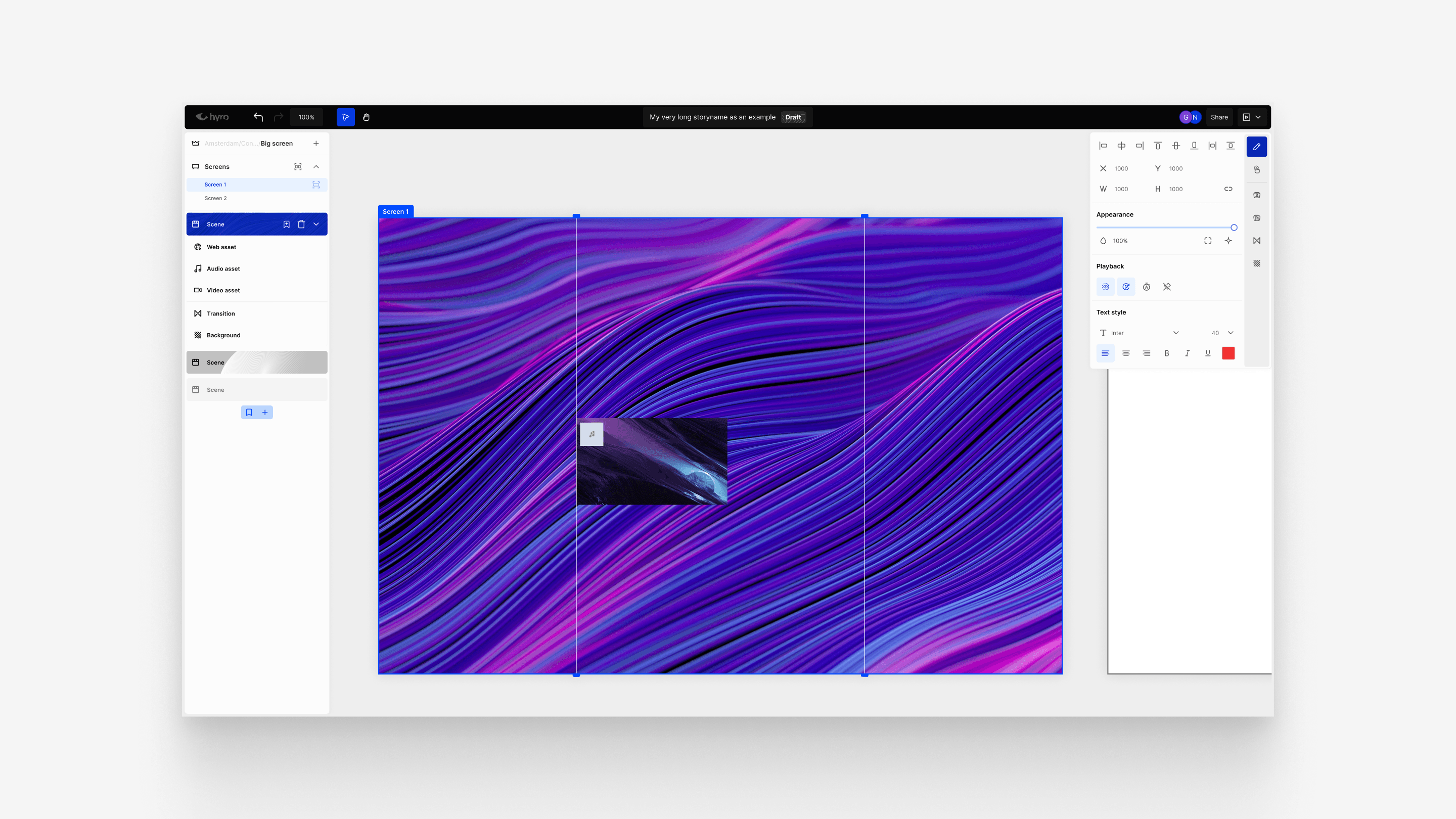
To solve the UI scalability and usability issues, the solution involved creating a completely new design system that would not only address current challenges but also support future growth and adaptability. The design system was developed within Figma, ensuring that all components, assets, and styles were both consistent and easily accessible for the design and development teams. The goal was to create a scalable system that would facilitate faster iterations, better collaboration, and a more streamlined design process, allowing the team to work efficiently and with greater precision.
Scalable Styles and Components
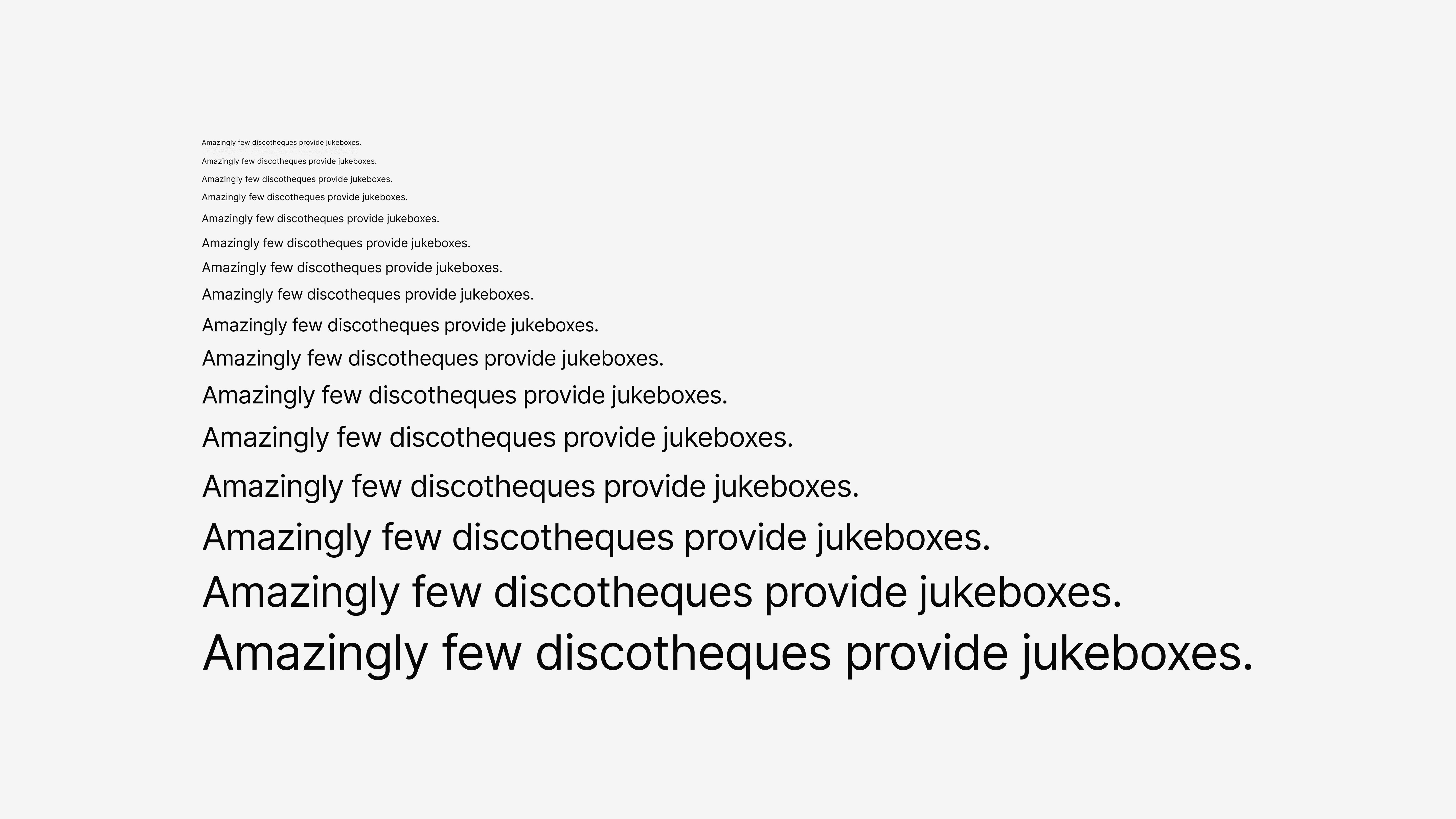
The design system focused on creating a modular and scalable library of reusable components and styles. Every element, from buttons to navigation bars and form inputs, was built with scalability in mind, ensuring consistency across the platform while allowing flexibility for customization as the product evolved. The components were designed to be responsive, maintaining their integrity across various screen sizes and layouts. With Figma as the central tool, each component was thoroughly documented, ensuring that every designer and developer had clear guidelines on how to use, modify, and extend these elements. This ensured that the system could evolve smoothly without sacrificing visual consistency.
Color System for Accessibility
A core part of the design system was the development of a robust color system that not only provided a visually appealing aesthetic but also adhered to accessibility standards. This system was built to ensure compliance with APCA (Accessible Perceptual Contrast Algorithm) and WCAG (Web Content Accessibility Guidelines), making it easier to check and maintain high accessibility standards throughout the design process.
The color system was structured to provide clear visual hierarchy while ensuring that text and UI elements maintained adequate contrast for readability. The palette was composed of main colors, along with four different shades lighter and four darker for each, allowing designers to easily create depth, emphasis, and visual differentiation across the interface. These shades were carefully crafted to ensure consistent contrast ratios, providing a balanced and accessible color experience for all users, including those with visual impairments.
By structuring the color palette this way, the design team could quickly assess whether color choices met accessibility standards using built-in tools in Figma, simplifying the review process and reducing the risk of non-compliance. Additionally, the flexibility of the color system allowed for easy adaptation to various branding needs while maintaining accessibility standards.
Detailed Documentation and Descriptive Text
A key aspect of this new design system was its comprehensive documentation. Each style, component, and asset was accompanied by detailed descriptions in Figma, outlining the purpose and best practices for use. These descriptions ensured that any designer or developer could quickly understand how to implement the system, even as new team members joined or as the platform evolved. The documentation included not only visual guidelines but also accessibility notes, helping the team maintain consistent standards across all parts of the product.

Concept
This concept represents a new era of design—one where aesthetics and strategy work hand in hand to create something truly extraordinary.
Willow Studio is built on the idea that design should be more than just visually appealing—it should tell a story, create an experience, and leave a lasting impact. This concept project embodies the perfect balance of creativity and functionality, ensuring that every element serves a purpose. With a strong emphasis on innovation, storytelling, and seamless execution, Willow Studio is designed to help brands craft a unique and compelling visual identity. Our goal is to push the boundaries of traditional design by blending art, technology, and strategy into a cohesive experience. Whether it's branding, web design, or digital experiences, Willow Studio focuses on delivering solutions that captivate, engage, and inspire.
More Works
(GQ® — 02)
©2025
2023
The design system for a new designer
This case study focuses on the redesign of Hyro’s design system to address scalability and usability issues. A new, modular system was developed in Figma to improve consistency and speed up design workflows.
Photography
Studio
Know More
Building a scalable future: Designing a flexible system for growth and consistency.
Redesigning for Scale: Developing a Robust Design System for Hyro
This project was completed during my time at Purple Digital, where I worked on their core SaaS product, Hyro—an enterprise-level presentation platform designed for immersive experience rooms and customer experience centers. The platform empowers large corporations to deliver interactive and engaging presentations. As the client base and user demand grew, it became evident that the existing implementation was not scalable. I was tasked with identifying and designing a solution that would support the platform’s growth and performance needs. To facilitate this major transformation, a new design system was developed to ensure consistency, efficiency, and scalability across the product.
Problem
A scalable design system: Empowering faster design and a seamless user experience.
As Hyro scaled to meet the demands of an expanding user base, significant issues emerged within the existing UI. The platform’s user interface, initially designed for smaller teams, began to show its limitations as large corporations with complex needs adopted the tool. The UI’s design relied heavily on fixed sections and inefficient use of screen space, with small elements taking up too much room, resulting in a cluttered and unorganized interface. This caused the workspace to shrink and negatively impacted the user experience—especially for those creating immersive presentations where visual clarity was paramount.
Additionally, the platform’s internal structure was disjointed, and many essential tools were buried behind multiple clicks or hidden in dropdown menus, leading to a cumbersome and frustrating navigation experience. As the product evolved, it became clear that these UI flaws were not sustainable and would hinder future growth. The lack of scalability, poor usability, and inconsistent design led to reduced user satisfaction and posed a significant challenge for the development team when it came to maintaining and expanding the platform.
To address these challenges and position Hyro for long-term success, a new design system was required. This system needed to provide a consistent, scalable framework that could accommodate future updates while improving user experience. Equally important, the design system had to facilitate faster and more efficient design processes for the team. By streamlining design workflows, creating reusable components, and ensuring consistency across all elements, the new system would enable designers to move quickly and iteratively—empowering them to deliver updates and new features without the bottlenecks caused by an inefficient, outdated interface.
Ultimately, the new design system would not only improve the user experience but also enhance the team’s ability to work faster, more efficiently, and more cohesively as the platform continued to grow and evolve.
Solution
Building a scalable, accessible design system for future growth and efficiency.
To solve the UI scalability and usability issues, the solution involved creating a completely new design system that would not only address current challenges but also support future growth and adaptability. The design system was developed within Figma, ensuring that all components, assets, and styles were both consistent and easily accessible for the design and development teams. The goal was to create a scalable system that would facilitate faster iterations, better collaboration, and a more streamlined design process, allowing the team to work efficiently and with greater precision.
Scalable Styles and Components
The design system focused on creating a modular and scalable library of reusable components and styles. Every element, from buttons to navigation bars and form inputs, was built with scalability in mind, ensuring consistency across the platform while allowing flexibility for customization as the product evolved. The components were designed to be responsive, maintaining their integrity across various screen sizes and layouts. With Figma as the central tool, each component was thoroughly documented, ensuring that every designer and developer had clear guidelines on how to use, modify, and extend these elements. This ensured that the system could evolve smoothly without sacrificing visual consistency.
Color System for Accessibility
A core part of the design system was the development of a robust color system that not only provided a visually appealing aesthetic but also adhered to accessibility standards. This system was built to ensure compliance with APCA (Accessible Perceptual Contrast Algorithm) and WCAG (Web Content Accessibility Guidelines), making it easier to check and maintain high accessibility standards throughout the design process.
The color system was structured to provide clear visual hierarchy while ensuring that text and UI elements maintained adequate contrast for readability. The palette was composed of main colors, along with four different shades lighter and four darker for each, allowing designers to easily create depth, emphasis, and visual differentiation across the interface. These shades were carefully crafted to ensure consistent contrast ratios, providing a balanced and accessible color experience for all users, including those with visual impairments.
By structuring the color palette this way, the design team could quickly assess whether color choices met accessibility standards using built-in tools in Figma, simplifying the review process and reducing the risk of non-compliance. Additionally, the flexibility of the color system allowed for easy adaptation to various branding needs while maintaining accessibility standards.
Detailed Documentation and Descriptive Text
A key aspect of this new design system was its comprehensive documentation. Each style, component, and asset was accompanied by detailed descriptions in Figma, outlining the purpose and best practices for use. These descriptions ensured that any designer or developer could quickly understand how to implement the system, even as new team members joined or as the platform evolved. The documentation included not only visual guidelines but also accessibility notes, helping the team maintain consistent standards across all parts of the product.
Concept
This concept represents a new era of design—one where aesthetics and strategy work hand in hand to create something truly extraordinary.
Willow Studio is built on the idea that design should be more than just visually appealing—it should tell a story, create an experience, and leave a lasting impact. This concept project embodies the perfect balance of creativity and functionality, ensuring that every element serves a purpose. With a strong emphasis on innovation, storytelling, and seamless execution, Willow Studio is designed to help brands craft a unique and compelling visual identity. Our goal is to push the boundaries of traditional design by blending art, technology, and strategy into a cohesive experience. Whether it's branding, web design, or digital experiences, Willow Studio focuses on delivering solutions that captivate, engage, and inspire.
More Works
©2025