2023
Hyro Files system Rework
This case study explores the redesign of Hyro’s file and user management system, aimed at addressing fragmented UI. The new concept streamlines common actions, enhances visual hierarchy, and provides a scalable solution for future growth.
UI Design
Concept
Know More
As Hyro expanded, the need for a unified, intuitive file and user management system became clear — one that could scale with the platform and enhance user experience across all sectors.
Resetting a fragmented UI
This case study explores the evolution of the file and user management UI within the Hyro platform. Originally created as a proof of concept by a new designer and a team of developers, it was later expanded upon as the product grew into diverse sectors, from immersive experience rooms to customer experience centers. This expansion led to a fragmented UI, with conflicting design elements that didn’t align with the platform’s overall goals of seamless usability and coherence. Building on previous case studies, this project focuses on streamlining and harmonizing the user interface to better manage files and users, ensuring a consistent experience across the platform.

Problem
As Hyro expanded, its fragmented file and user management UI (pictured above) became a barrier to seamless, intuitive experiences across diverse sectors.
The initial file and user management UI of Hyro, developed as a proof of concept by a new designer and a team of developers, presented a range of usability challenges. As the platform expanded across multiple sectors, including immersive experience rooms and customer experience centers, the UI became increasingly fragmented. The absence of a unified design language resulted in inconsistent user flows, conflicting visual elements, and a lack of intuitive navigation. This fragmented approach hindered the overall user experience, making it difficult for users to efficiently manage files and interact with the platform across different contexts. The goal of this project was to address these inconsistencies and create a cohesive, streamlined UI that could scale with the platform's growth while enhancing usability and accessibility.
Solution
By implementing a unified design system and simplifying common actions, the team created a scalable and intuitive interface that ensures consistent usability across Hyro’s expanding platform.
To resolve the challenges posed by the fragmented UI, the design team implemented a new, comprehensive design system aimed at providing a cohesive experience across both sections of Hyro. By establishing standardized visual elements, the team created a unified interface that ensured seamless navigation between file and user management, regardless of the sector or context. Common actions, such as opening documents, were restructured to simplify the process, reducing unnecessary steps and improving overall efficiency for the user.
The design also prioritized a clear visual hierarchy, which helped improve the structure of the interface and made it easier for users to identify key actions and information. Thoughtful use of space ensured that there was room for future expansion, making the design scalable as Hyro continues to grow. Furthermore, the consistent use of newly designed, unique icons reinforced both the brand’s identity and the interface’s usability, providing a consistent visual language across the platform. This combination of a streamlined, intuitive layout, coupled with a focus on future-proofing and scalability, addressed the core usability issues while enhancing the user experience for both current and future users.


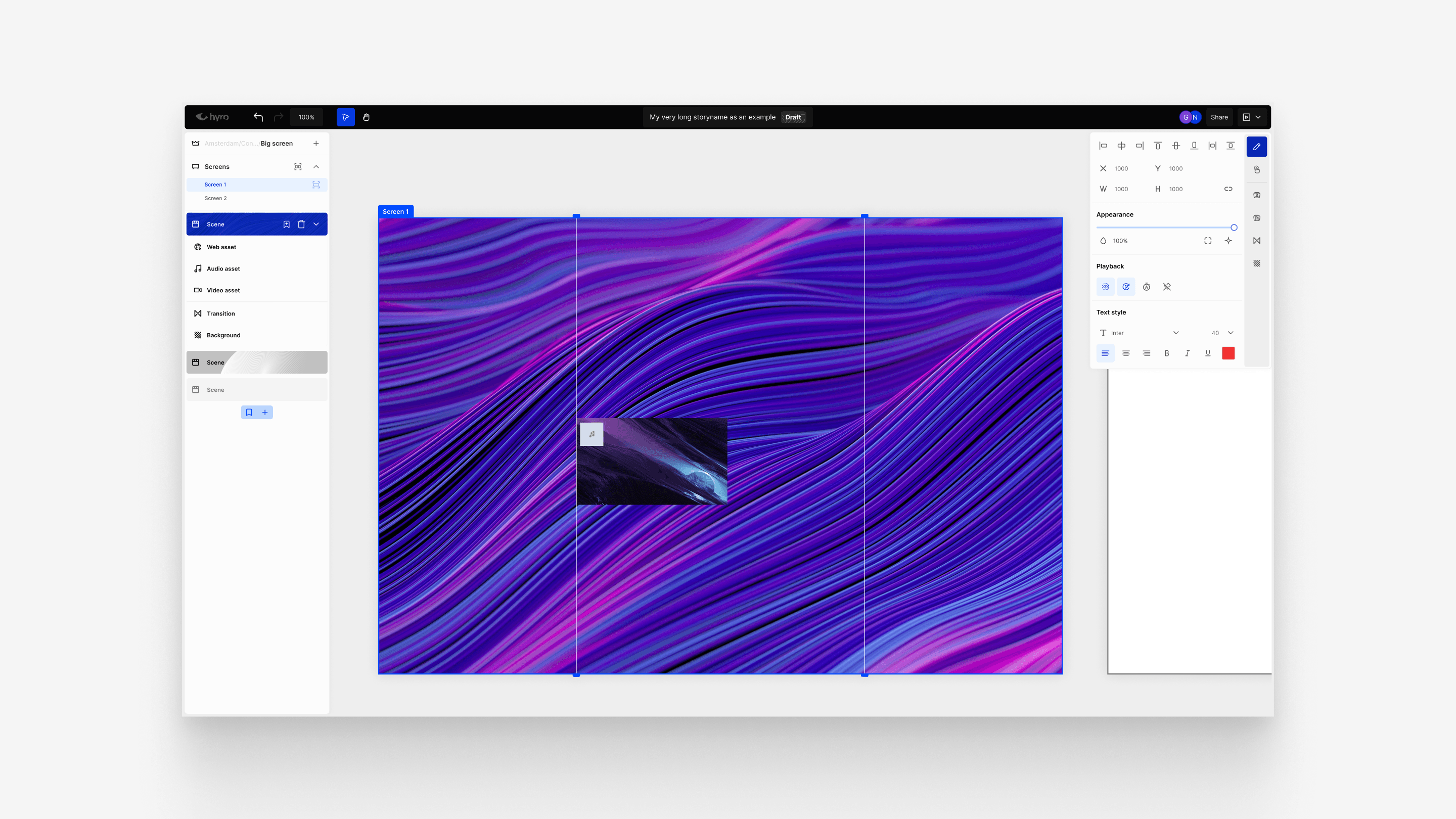
Concept
The new file and user management concept not only resolved existing challenges but also ignited excitement across the team, aligning everyone with a shared vision for Hyro’s future growth.
The new concept for file and user management provided the team with a clear vision for the future of Hyro. By simplifying common actions, improving visual hierarchy, and ensuring scalability, the new approach brought coherence and consistency to the platform. This shift not only resolved existing issues but also generated excitement across the company, as everyone—from developers to stakeholders—saw the potential for enhanced usability and future growth. The team was energized by the direction of the project, confident that the improvements would pave the way for continued success and innovation.
More Works
(GQ® — 02)
©2025

2023
Hyro Files system Rework
This case study explores the redesign of Hyro’s file and user management system, aimed at addressing fragmented UI. The new concept streamlines common actions, enhances visual hierarchy, and provides a scalable solution for future growth.
UI Design
Concept
Know More
As Hyro expanded, the need for a unified, intuitive file and user management system became clear — one that could scale with the platform and enhance user experience across all sectors.
Resetting a fragmented UI
This case study explores the evolution of the file and user management UI within the Hyro platform. Originally created as a proof of concept by a new designer and a team of developers, it was later expanded upon as the product grew into diverse sectors, from immersive experience rooms to customer experience centers. This expansion led to a fragmented UI, with conflicting design elements that didn’t align with the platform’s overall goals of seamless usability and coherence. Building on previous case studies, this project focuses on streamlining and harmonizing the user interface to better manage files and users, ensuring a consistent experience across the platform.
Problem
As Hyro expanded, its fragmented file and user management UI (pictured above) became a barrier to seamless, intuitive experiences across diverse sectors.
The initial file and user management UI of Hyro, developed as a proof of concept by a new designer and a team of developers, presented a range of usability challenges. As the platform expanded across multiple sectors, including immersive experience rooms and customer experience centers, the UI became increasingly fragmented. The absence of a unified design language resulted in inconsistent user flows, conflicting visual elements, and a lack of intuitive navigation. This fragmented approach hindered the overall user experience, making it difficult for users to efficiently manage files and interact with the platform across different contexts. The goal of this project was to address these inconsistencies and create a cohesive, streamlined UI that could scale with the platform's growth while enhancing usability and accessibility.
Solution
By implementing a unified design system and simplifying common actions, the team created a scalable and intuitive interface that ensures consistent usability across Hyro’s expanding platform.
To resolve the challenges posed by the fragmented UI, the design team implemented a new, comprehensive design system aimed at providing a cohesive experience across both sections of Hyro. By establishing standardized visual elements, the team created a unified interface that ensured seamless navigation between file and user management, regardless of the sector or context. Common actions, such as opening documents, were restructured to simplify the process, reducing unnecessary steps and improving overall efficiency for the user.
The design also prioritized a clear visual hierarchy, which helped improve the structure of the interface and made it easier for users to identify key actions and information. Thoughtful use of space ensured that there was room for future expansion, making the design scalable as Hyro continues to grow. Furthermore, the consistent use of newly designed, unique icons reinforced both the brand’s identity and the interface’s usability, providing a consistent visual language across the platform. This combination of a streamlined, intuitive layout, coupled with a focus on future-proofing and scalability, addressed the core usability issues while enhancing the user experience for both current and future users.
Concept
The new file and user management concept not only resolved existing challenges but also ignited excitement across the team, aligning everyone with a shared vision for Hyro’s future growth.
The new concept for file and user management provided the team with a clear vision for the future of Hyro. By simplifying common actions, improving visual hierarchy, and ensuring scalability, the new approach brought coherence and consistency to the platform. This shift not only resolved existing issues but also generated excitement across the company, as everyone—from developers to stakeholders—saw the potential for enhanced usability and future growth. The team was energized by the direction of the project, confident that the improvements would pave the way for continued success and innovation.
More Works
(GQ® — 02)
©2025
2023
Hyro Files system Rework
This case study explores the redesign of Hyro’s file and user management system, aimed at addressing fragmented UI. The new concept streamlines common actions, enhances visual hierarchy, and provides a scalable solution for future growth.
UI Design
Concept
Know More
As Hyro expanded, the need for a unified, intuitive file and user management system became clear — one that could scale with the platform and enhance user experience across all sectors.
Resetting a fragmented UI
This case study explores the evolution of the file and user management UI within the Hyro platform. Originally created as a proof of concept by a new designer and a team of developers, it was later expanded upon as the product grew into diverse sectors, from immersive experience rooms to customer experience centers. This expansion led to a fragmented UI, with conflicting design elements that didn’t align with the platform’s overall goals of seamless usability and coherence. Building on previous case studies, this project focuses on streamlining and harmonizing the user interface to better manage files and users, ensuring a consistent experience across the platform.
Problem
As Hyro expanded, its fragmented file and user management UI (pictured above) became a barrier to seamless, intuitive experiences across diverse sectors.
The initial file and user management UI of Hyro, developed as a proof of concept by a new designer and a team of developers, presented a range of usability challenges. As the platform expanded across multiple sectors, including immersive experience rooms and customer experience centers, the UI became increasingly fragmented. The absence of a unified design language resulted in inconsistent user flows, conflicting visual elements, and a lack of intuitive navigation. This fragmented approach hindered the overall user experience, making it difficult for users to efficiently manage files and interact with the platform across different contexts. The goal of this project was to address these inconsistencies and create a cohesive, streamlined UI that could scale with the platform's growth while enhancing usability and accessibility.
Solution
By implementing a unified design system and simplifying common actions, the team created a scalable and intuitive interface that ensures consistent usability across Hyro’s expanding platform.
To resolve the challenges posed by the fragmented UI, the design team implemented a new, comprehensive design system aimed at providing a cohesive experience across both sections of Hyro. By establishing standardized visual elements, the team created a unified interface that ensured seamless navigation between file and user management, regardless of the sector or context. Common actions, such as opening documents, were restructured to simplify the process, reducing unnecessary steps and improving overall efficiency for the user.
The design also prioritized a clear visual hierarchy, which helped improve the structure of the interface and made it easier for users to identify key actions and information. Thoughtful use of space ensured that there was room for future expansion, making the design scalable as Hyro continues to grow. Furthermore, the consistent use of newly designed, unique icons reinforced both the brand’s identity and the interface’s usability, providing a consistent visual language across the platform. This combination of a streamlined, intuitive layout, coupled with a focus on future-proofing and scalability, addressed the core usability issues while enhancing the user experience for both current and future users.
Concept
The new file and user management concept not only resolved existing challenges but also ignited excitement across the team, aligning everyone with a shared vision for Hyro’s future growth.
The new concept for file and user management provided the team with a clear vision for the future of Hyro. By simplifying common actions, improving visual hierarchy, and ensuring scalability, the new approach brought coherence and consistency to the platform. This shift not only resolved existing issues but also generated excitement across the company, as everyone—from developers to stakeholders—saw the potential for enhanced usability and future growth. The team was energized by the direction of the project, confident that the improvements would pave the way for continued success and innovation.
More Works
©2025